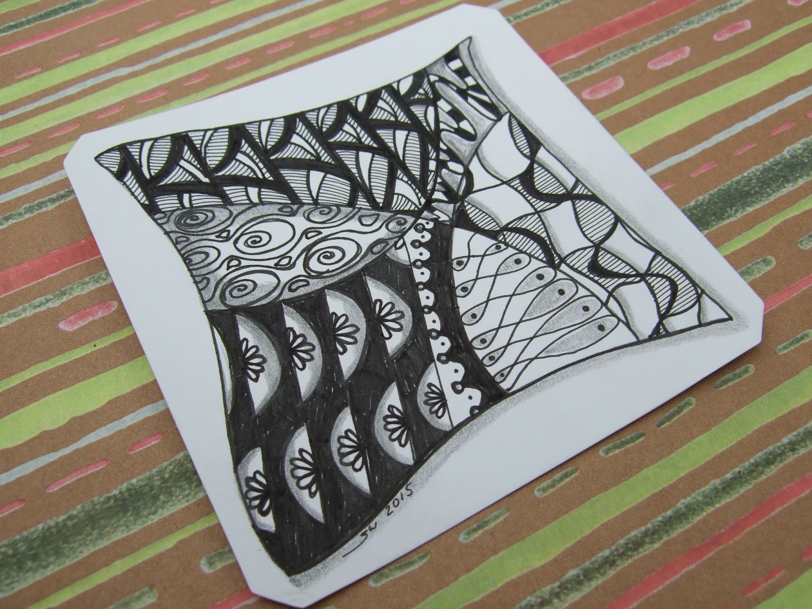
I should have spent more time on this Zentangle. I am not too fond of the paperweights design on the bottom left but I like the soundbites and wishbones on the bottom right! The Flurry at the top required a lot of concentration. Other designs above include snake, queen's crown and algae.
To find out more about Zentangle click here.

Actually when I looked at your artwork Simone, just before I read your text, I thought to myself I like the design on the bottom left, we all see things differently!
ReplyDeleteHave a great weekend,
V x
I like it!! It reminds me of the patchwork fabric I am currently playing with
ReplyDeleteJulie xxxxxxxxxx
Looks very complicated, Simone - I quite like the design bottom left. Have a happy weekend:)
ReplyDeleteI like the queens crown one.
ReplyDeleteLisa x
I think it looks great. Sorry you're not happy with it, but I guess that's the way it goes sometimes.
ReplyDelete